WHY DOES A COMPANY CHANGE ITS LOGO? – AND WHY IS THIS GOOD FOR US, TOO?
When a large corporation changes its look, many people ask, “What was wrong with the old one?” These are entirely valid questions. However, a rebranding is not a cosmetic procedure; rather, it is more like a thorough technical review: the point is not to dazzle, but to accurately reflect what the company truly stands for.
This is especially true for the Duna Group. We’re talking about a company whose main areas of activity include among others road construction and renovation, bridge building, complex infrastructure development, and the implementation of environmental protection projects—in other words, things that need to function for decades, even generations. Here, reliability, engineering precision, and long-term thinking are part of daily practice.
WHAT IS A BRAND IMAGE GOOD FOR, ANYWAY?
A company’s brand image is like a person’s first impression. It doesn’t tell you everything, but it reveals a lot. It conveys a mood. It builds trust—or destroys it. A well-crafted brand image conveys the message:
“We know what we’re doing, and we take responsibility for it.”
The Duna Group’s previous image carried this message for a long time. The new one, however, speaks the language of a different era.
WHY IS IT NECESSARY TO RENEW OURSELVES FROM TIME TO TIME?
The world is changing. Technology, expectations, and scale are changing too. A company that is now present not only in Hungary but also in Romania, Poland, the Czech Republic, and Africa is not the same company it was twenty or thirty years ago.
The rebranding is the visual manifestation of this evolution. It is not a break with the past, but a further thinking of it.
WHAT DOES THE NEW DUNA GROUP IMAGE SUGGEST?
The new logo and visual world are cleaner, tighter, and more deliberate. It doesn’t aim to be flashy. Rather, it is precise. This is the engineering approach we take pride in with our work.
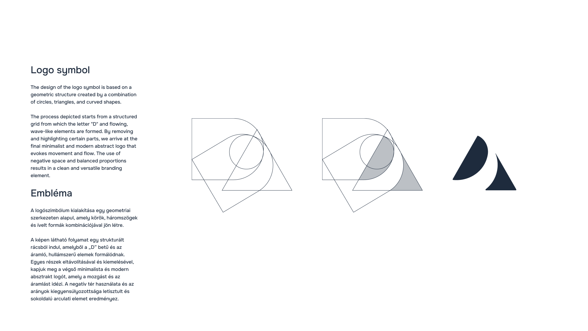
Proportionality and balance are evident in the formal system—it is no coincidence that the golden section is often mentioned in connection with design. This is not decoration, but a way of thinking: the kind of precision that is a fundamental requirement for us even in the construction of a bridge or a highway.
The new Duna Group colour palette conveys a more modern, international mood. The new typeface is definite, highly legible, and stable—like a well-designed support structure: unobtrusive, yet everything rests on it.
WHAT DOES THIS MEAN IN EVERYDAY LIFE?
Most people don’t analyze logos; they make decisions based on feelings. For an investor, a partner, a subcontractor, or even a young engineering student, the new image conveys this message:
This is a modern, well-prepared, internationally reflective large corporation. This is the Duna Group.
When a company’s image is aligned with what it actually does, we trust it even more. And when it comes to a road, a bridge, or an entire infrastructure, trust is not an aesthetic issue—it is a primary condition.
NOT A TREND, BUT A COMPASS
The Duna Group’s rebranding is not about following trends. Rather, it is the recalibration of a compass. It shows where the company came from, where it stands now, and where it is advancing.
Roads and bridges are visible. The image helps make visible what lies behind them: the knowledge, the systems mentality, and the engineering mindset that connects the past with the future.